Brand identity for a new european semi-private jet carrier
2024
Client
Travelcoup

The Challenge
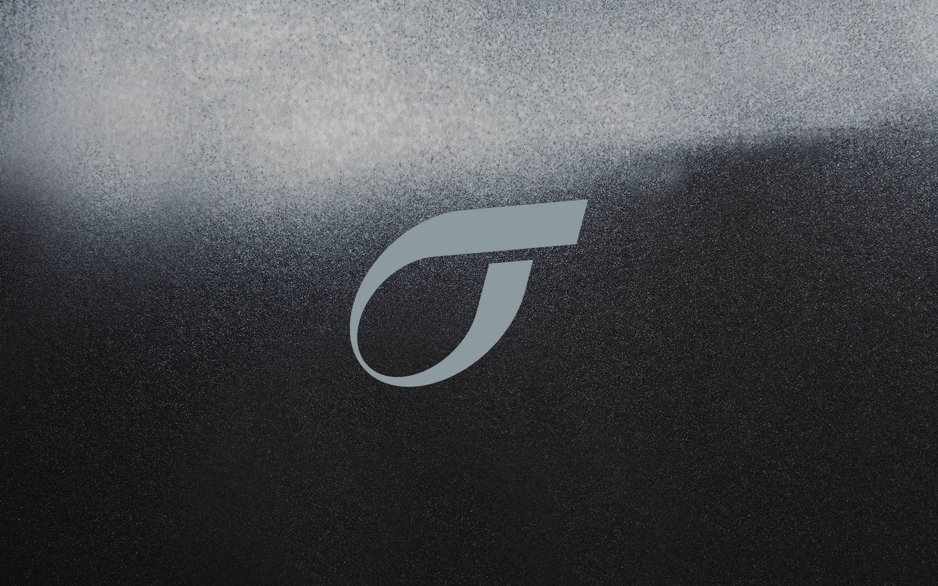
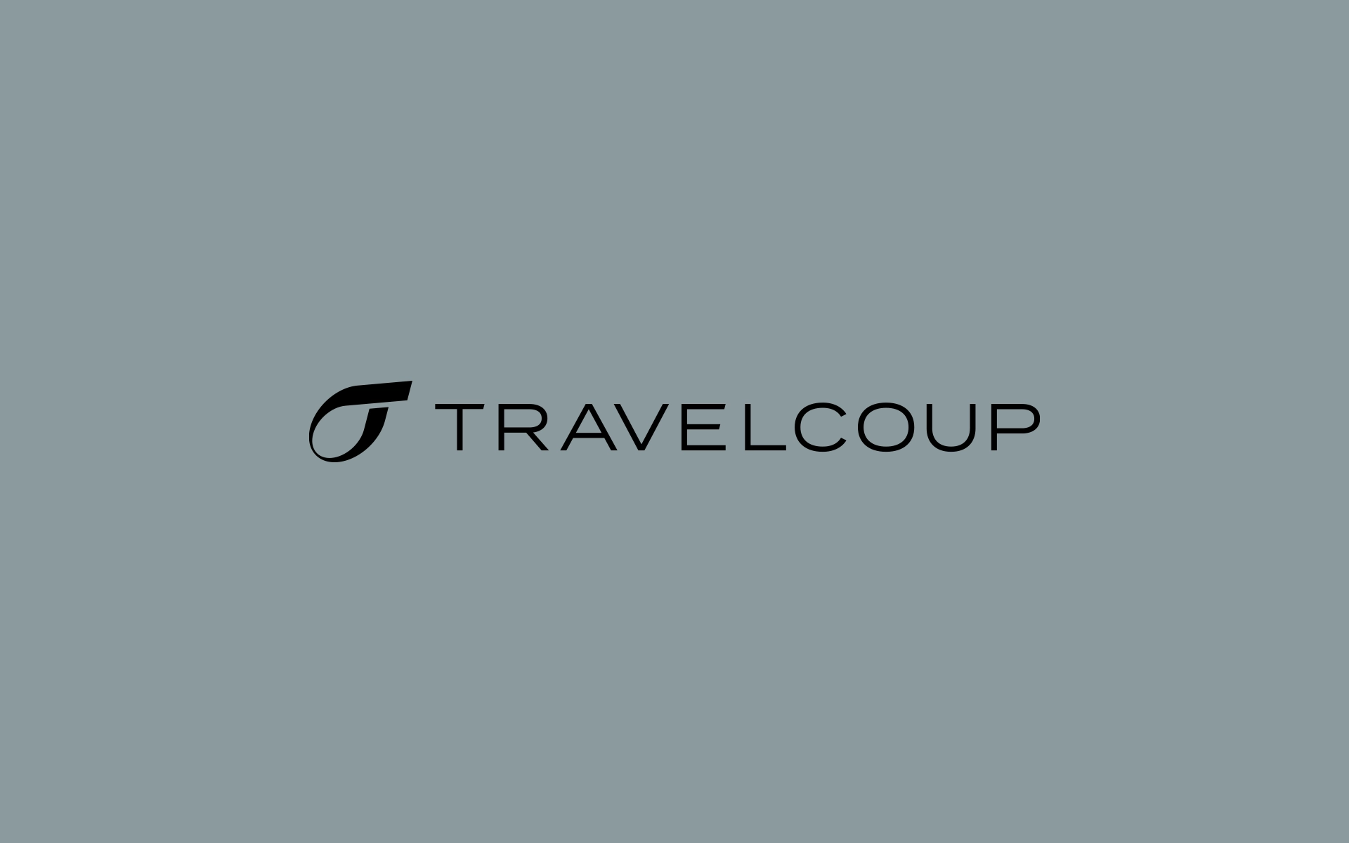
Travelcoup’s forward-looking mission is captured in the logo itself,
which combines the shape of the letter “T” and an energectic gush
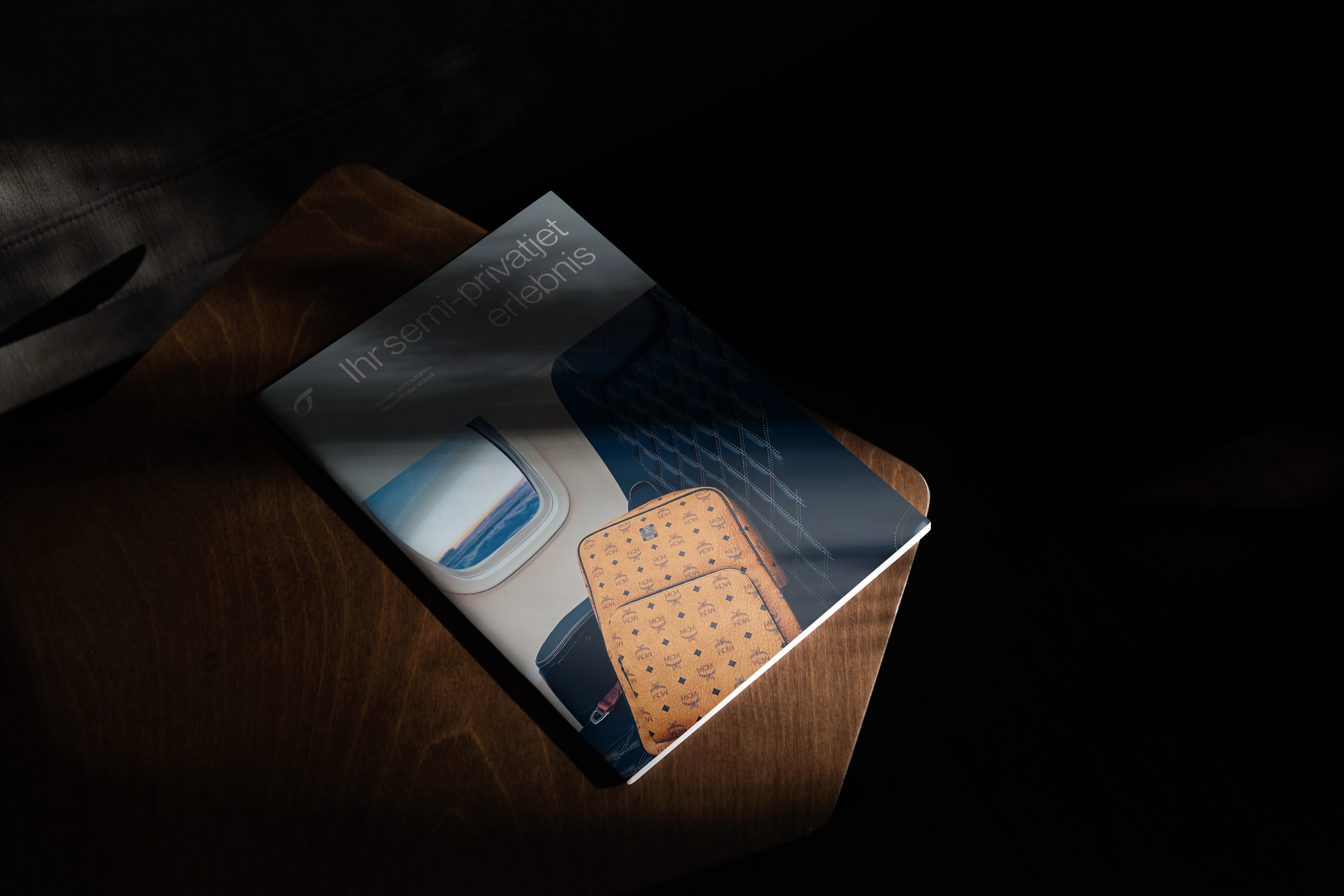
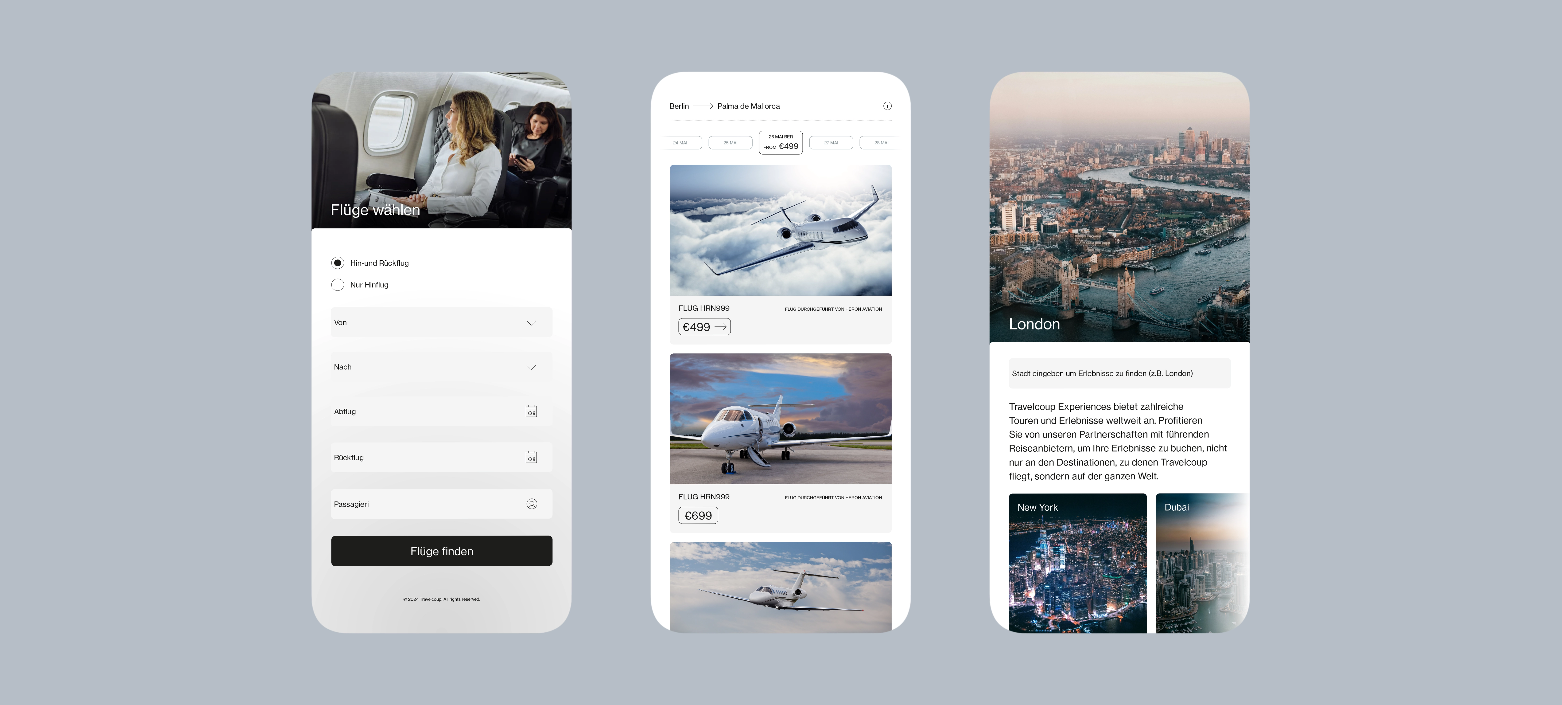
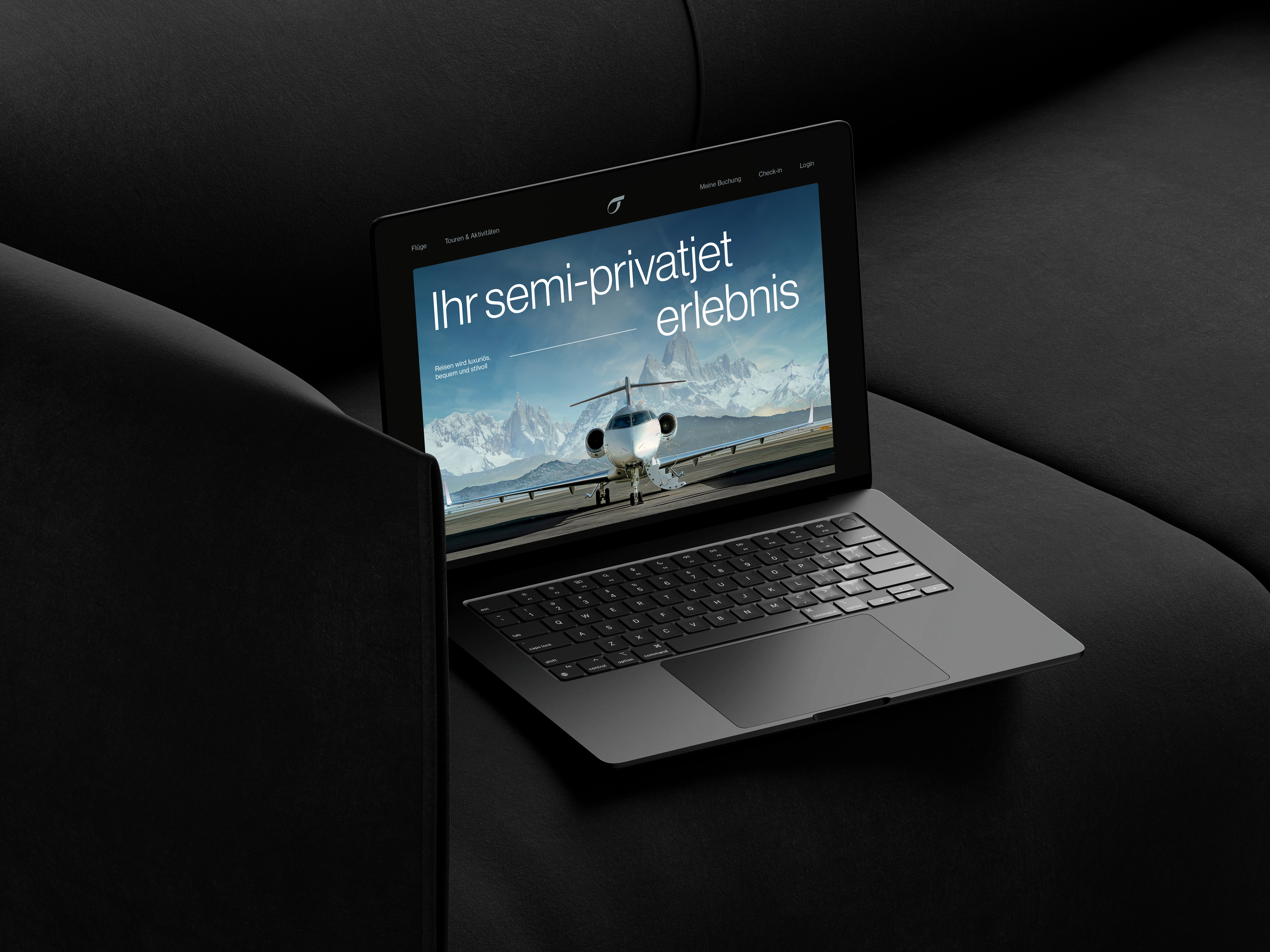
of air. The monogram is paired with an elegant and luxurious color palette. The brand is carried throughout the plane interiors and cabin crew uniforms for a cohesive experience of the brand that conveys thoughtfulness and trust. The clean geometry of the logo extends to a set of geometric layouts for print and digital applications. The project later evolved into product design for an booking app.
Feedback
— Jane Smith, CEO
“The professionalism and expertise demonstrated by the team were unparalleled, and we couldn’t be more pleased with the results. We’ve been able to achieve new levels of innovation and success in our industry.”


